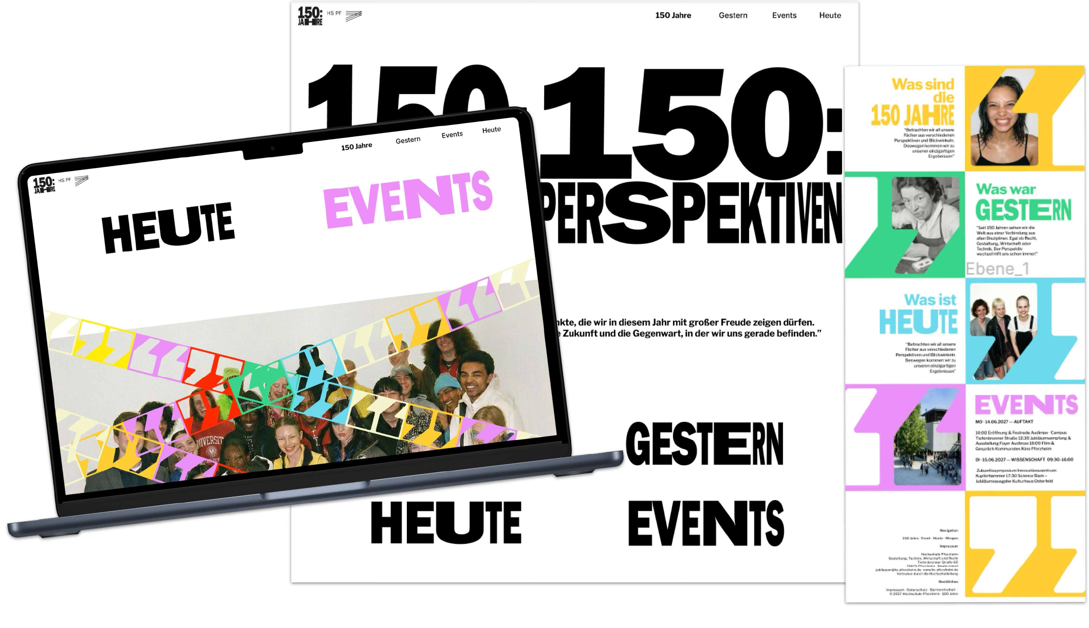
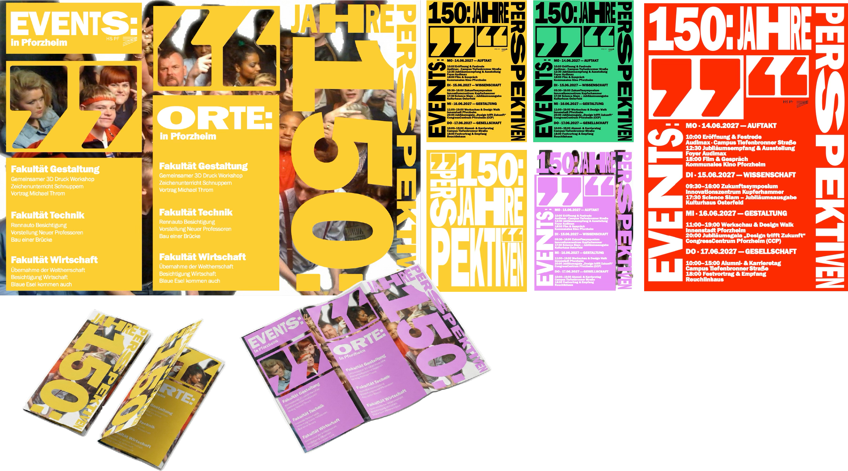
150 years 150 perspectives
3. Semester
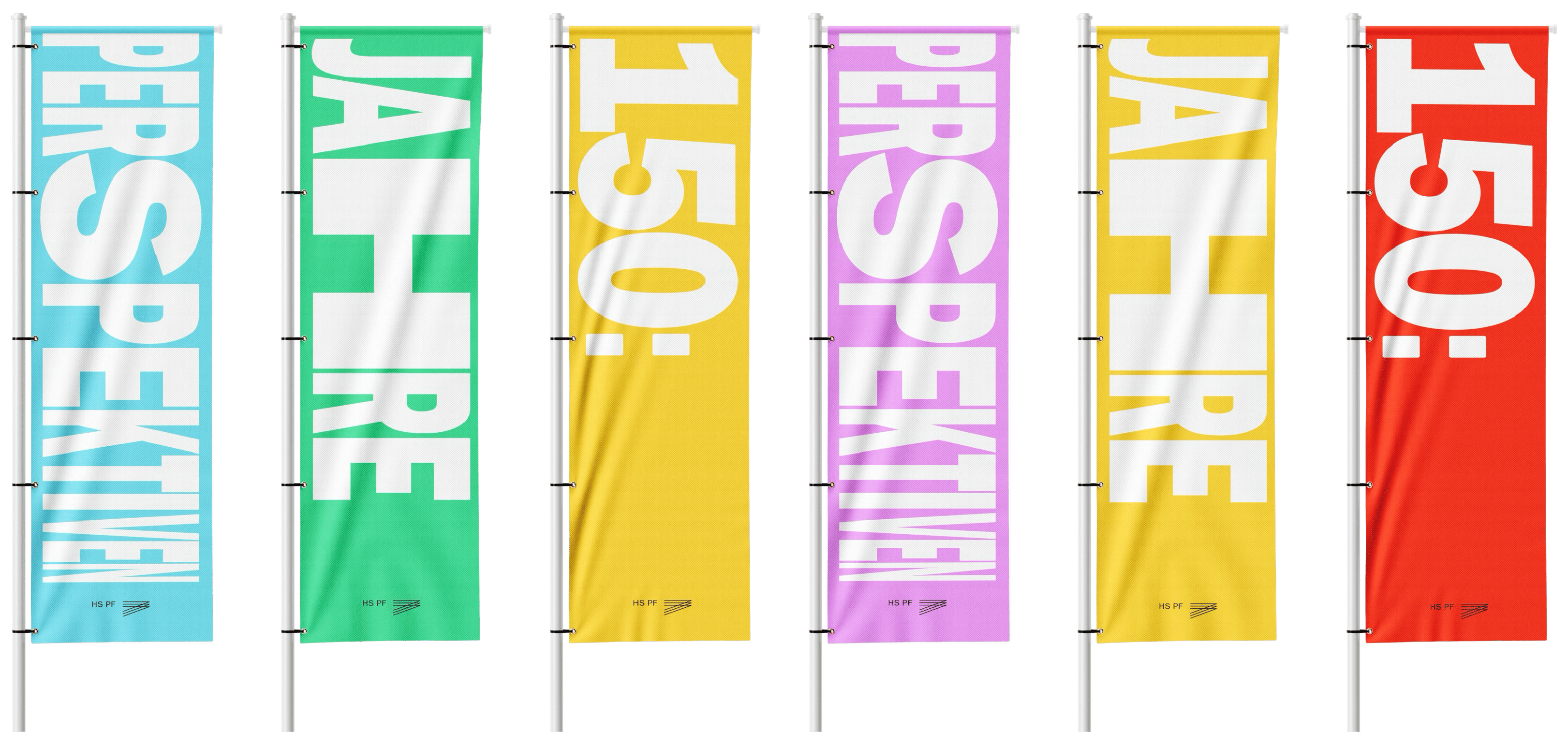
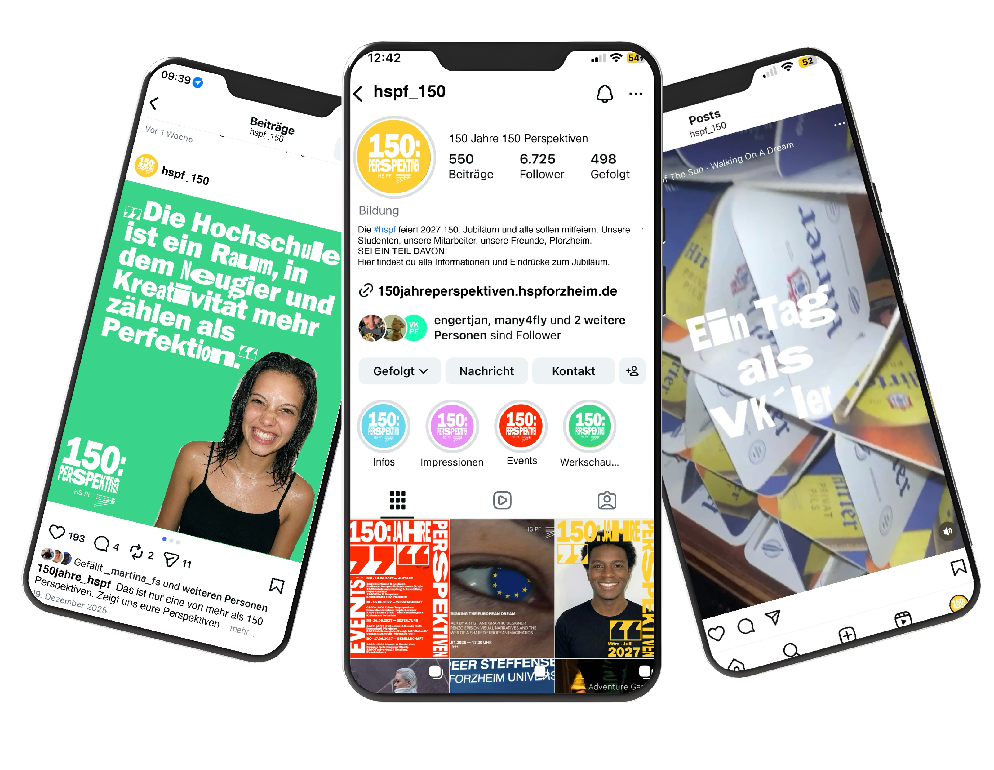
For the university’s 150th anniversary, I created a visual identity that goes beyond celebration.
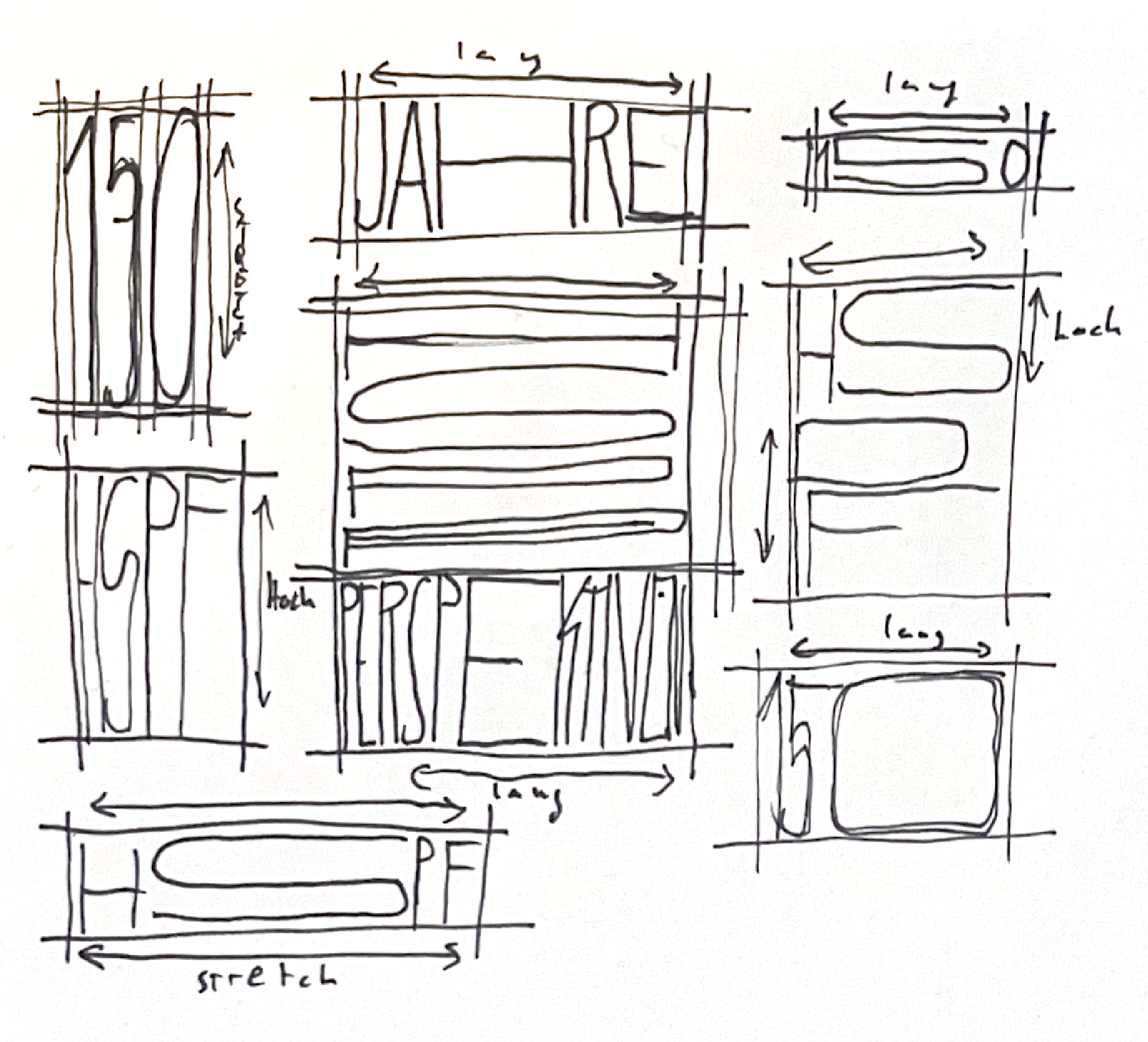
By utilizing typographic dynamism, the design constantly shifts perspectives.
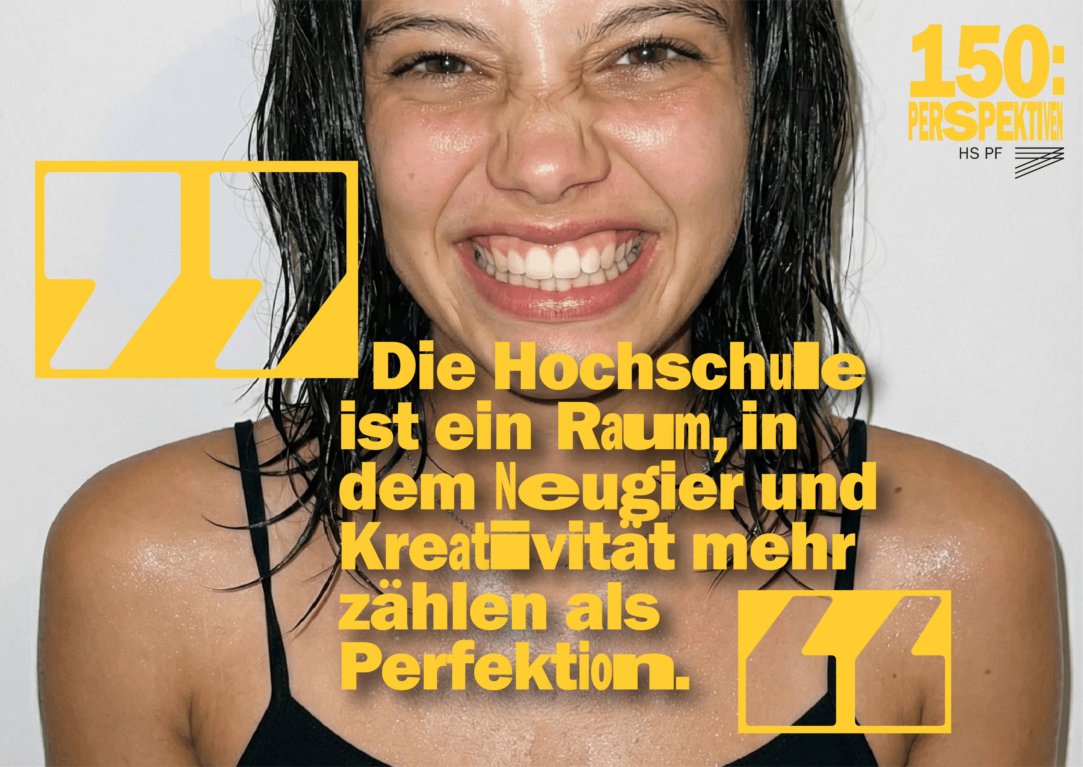
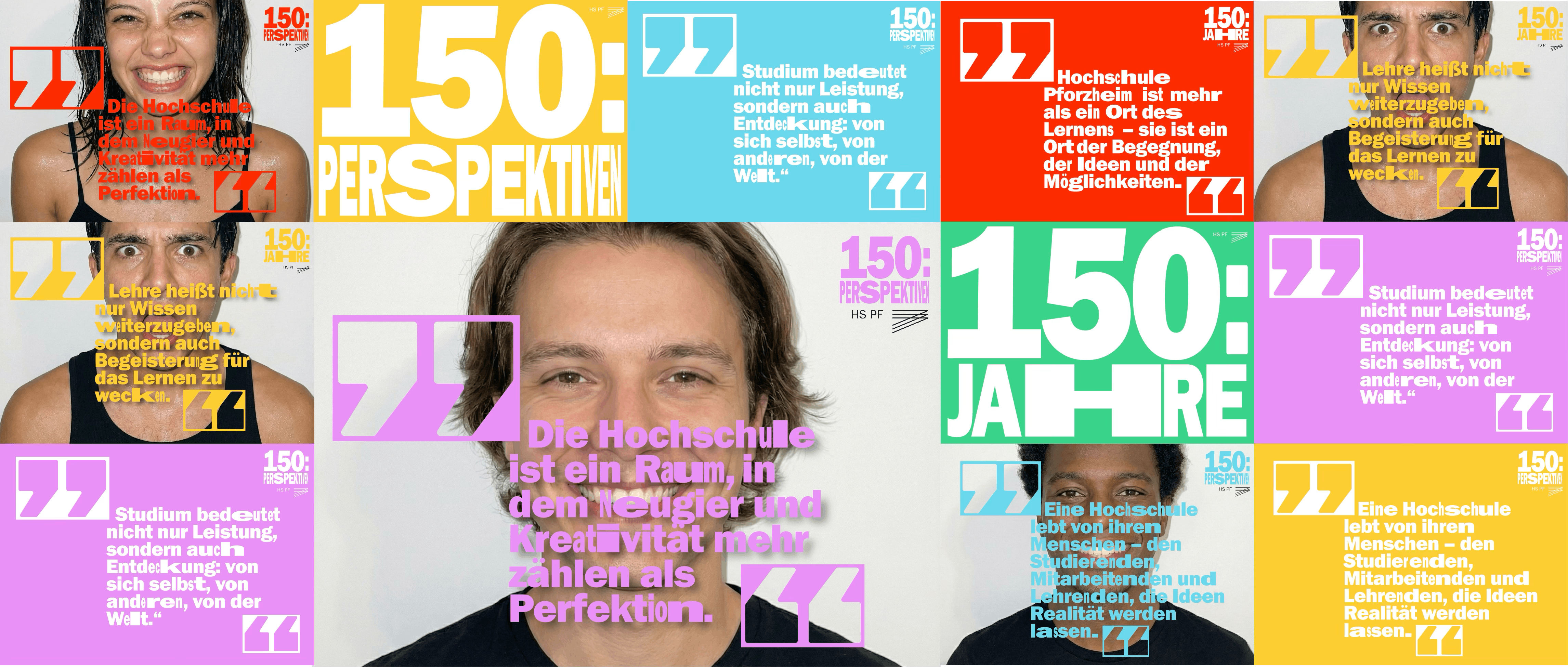
In the German language, quotation marks are used to highlight specific viewpoints.
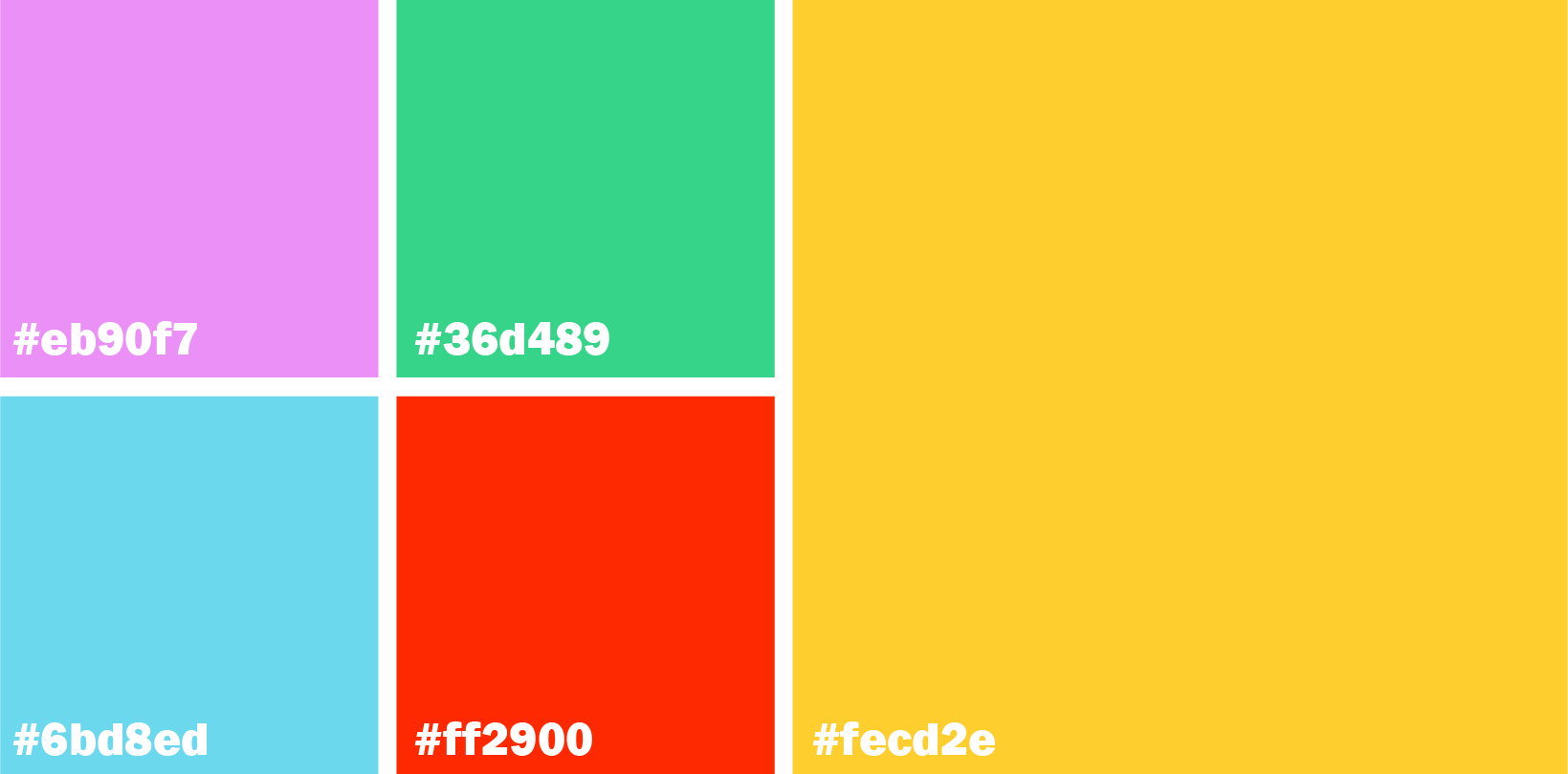
Also using the existing house font and house color yellow.
A concept I placed at the heart of this branding.
This project was awarded 2nd place in the official design competition, including a 1,000€ prize.
The identity was further expanded into a social media strategy focused on dynamic,
fast-paced Reels to engage the student community.